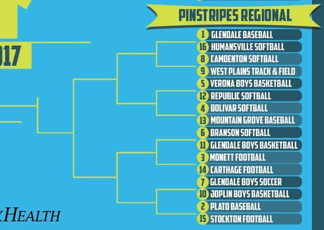
Welcome to the Pinstripes Regional of the 2017 Uniform Of The Year Bracket. This round of voting will remain open through midnight Sunday, March 19. Click here for the full bracket and here for the original introductory post explaining the bracket poll.
Each image can be clicked on for closer analysis.
[wpbvideo id=’302983′]
CLICK HERE FOR STIRRUPS REGIONAL VOTING
CLICK HERE FOR HIGH TOPS REGIONAL VOTING
CLICK HERE FOR SHORT SHORTS REGIONAL VOTING
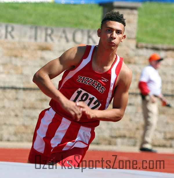
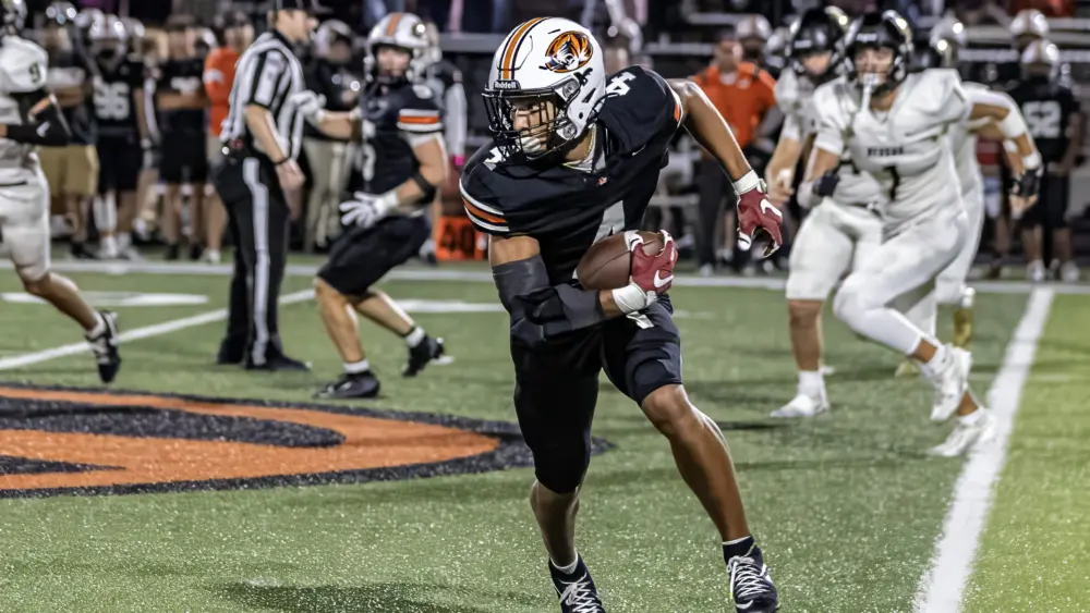
(1) Glendale Baseball vs. (16) Humansville Softball
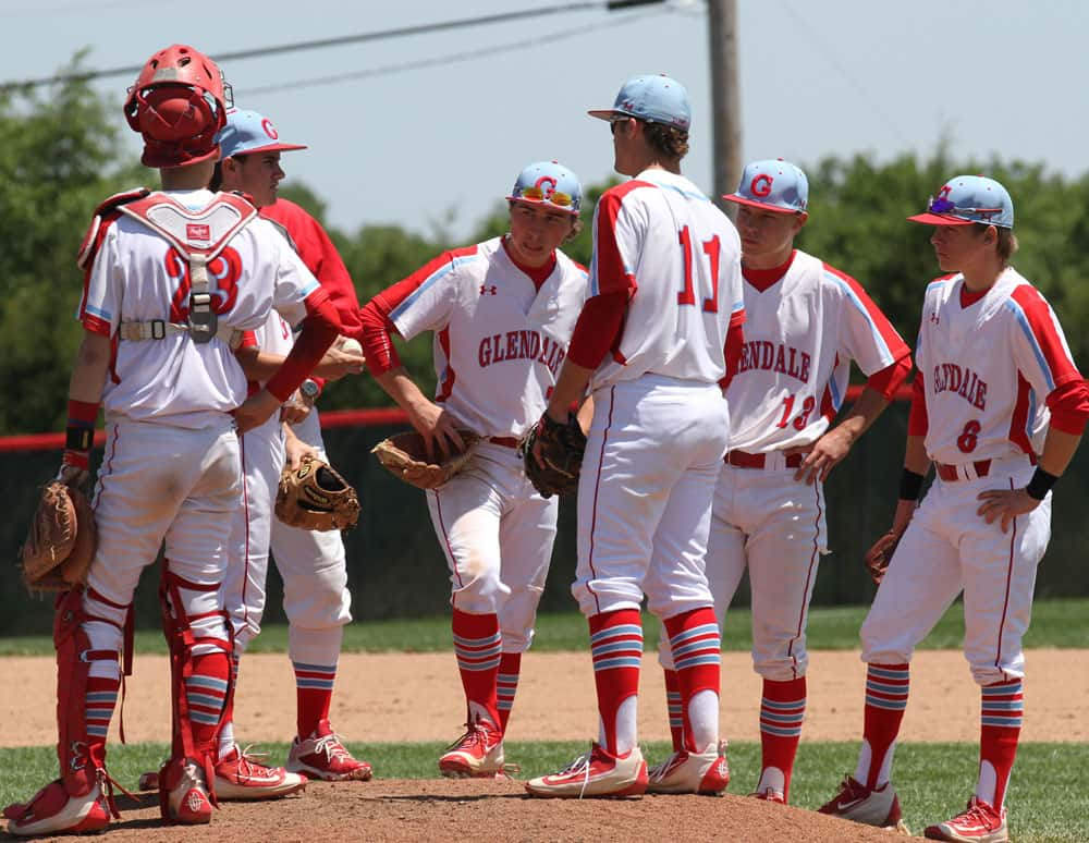
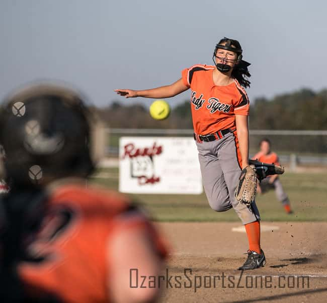
Glendale baseball did EVERYTHING right with these uniforms. Start with the stirrups. Red, each with three horizontal stripes, and within those horizontal stripes are a white/powder blue/white combo. Thin red stripe runs up the white pants. Then there’s the sleeves. A thick red stripe runs down from the shoulders, but not all the way to the collar, and that red is paired with thinner white and blue stripes. The lettering across the front is great and they choose a perfect font. Then the hat: red-brimmed, blue focus with a very cool “G” on the center. Well done. Humansville softball shows off a great orange/grey combination. There’s just something classic about these. The cursive “Lady Tigers” looks nice and the thick orange stripe up the pants brings your eye to those high socks.
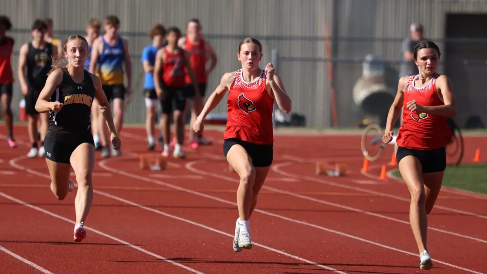
(8) Camdenton Softball vs. (9) West Plains Track & Field
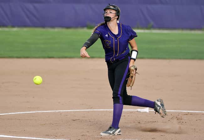
The purple and blacks work for Camdenton softball, in part because they didn’t try too hard. On top, we have a very traditional ball-style uniform. What makes it unique, however, is the “C” on the right side, and not the left, as well as the interlocking “HS” for “high school” that’s seen inside the “C.” West Plains track and field is on here for those glorious candy-cane striped shorts. No analysis needed. Just enjoy the view.
(5) Verona Boys Basketball vs. (12) Republic Softball
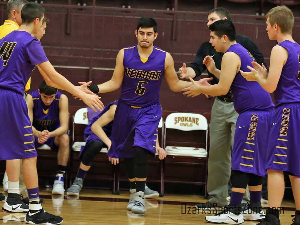
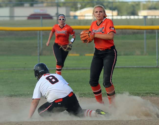
Interesting 5-12 matchup here, folks. At the 5-seed, we have what should be a pretty big mid-major sleeper with Verona boys basketball. The purple-on-purple is flashy, but what makes these is the black “VERONA” with that yellow outline, as well as the four yellow stripes on the shorts and the mascot name. This is Republic’s best softball uniform. Orange top and black bottoms looks good, but what gets these in the dance in the unique lettering/font with capital letters on the front and back-end of the cursive “RepubliC.”
(4) Bolivar Softball vs. (13) Mountain Grove Baseball
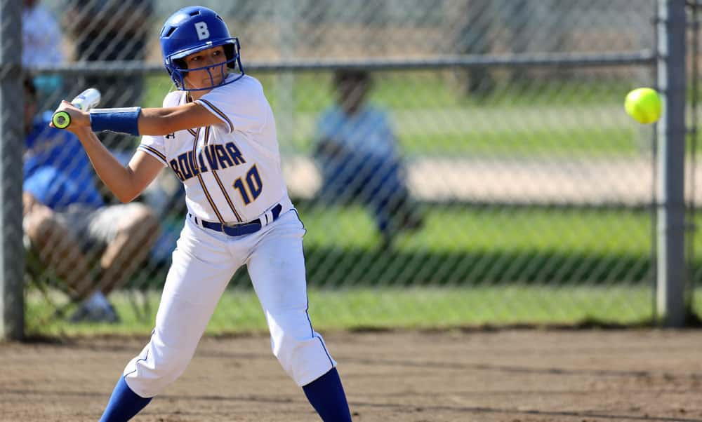
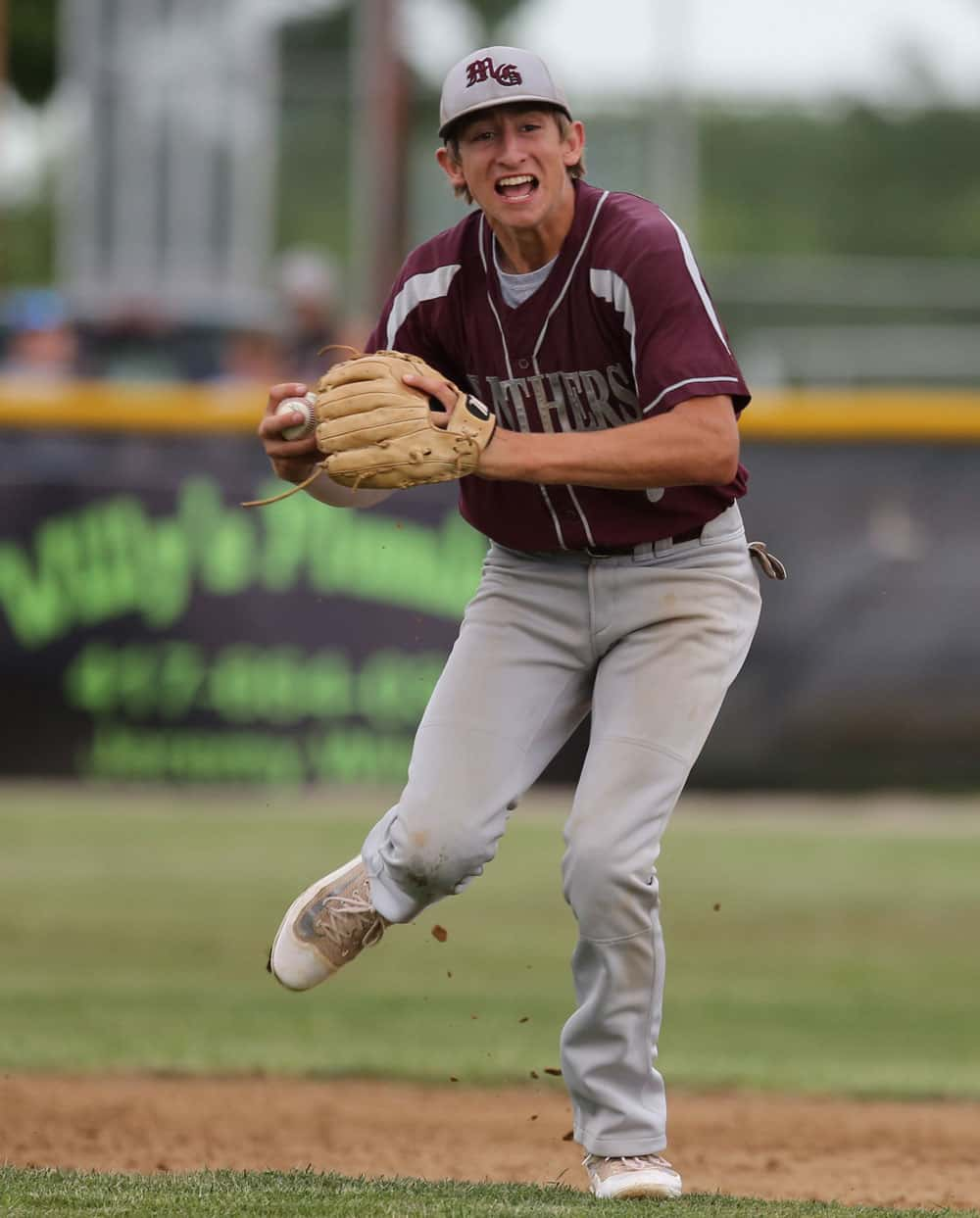
How can you not with these Bolivar softball uniforms? Absolutely perfect in the color scheme and simplistic design with the whites. There’s not much to say other than they know that Bolivar blue works and you really don’t have to try too hard to make a uniform look great with it. Mountain Grove baseball is here in many ways because of those hats. The olde-time offset “MG” is very cool and unique for the region. The straight block lettering across the uniform is also a bit of a rarity, and it looks good in silver.
(6) Branson Softball vs. (11) Glendale Boys Basketball
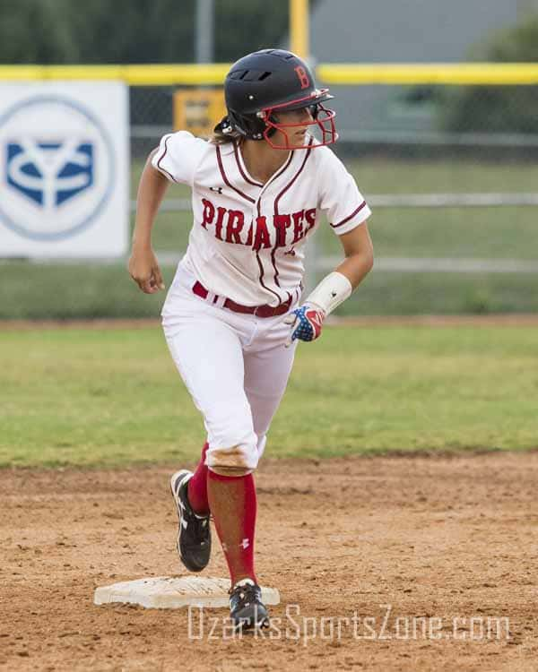
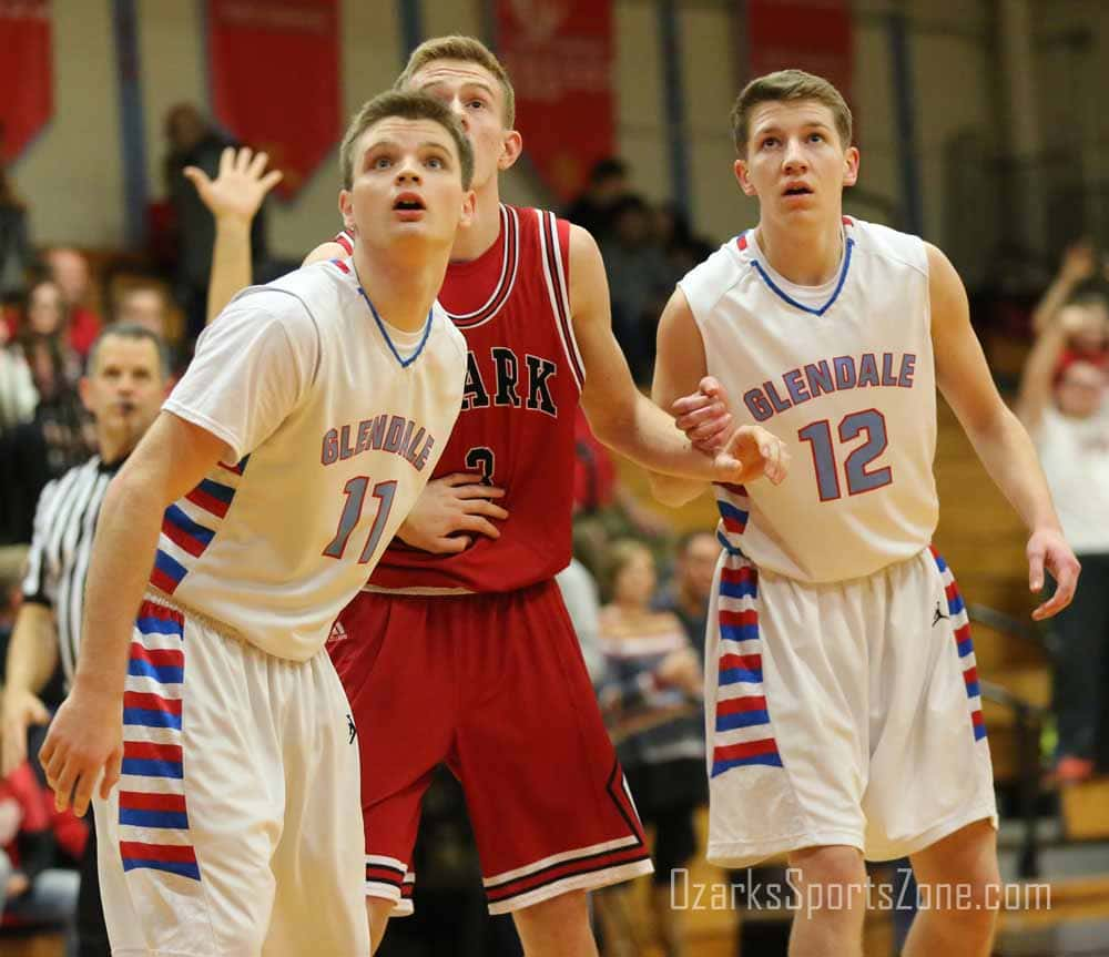
Branson softball did a fine job with these whites. We loved how the “PIRATES” stood out with the traditional baseball lettering across the chest, and there’s just something about the red “B” on the helmets/hats. For Glendale boys basketball, it’s those shorts. The royal blue/red/white stripe combo that run up the shorts and onto the jersey is a staple that never gets old.
(3) Monett Football vs. (14) Carthage Football
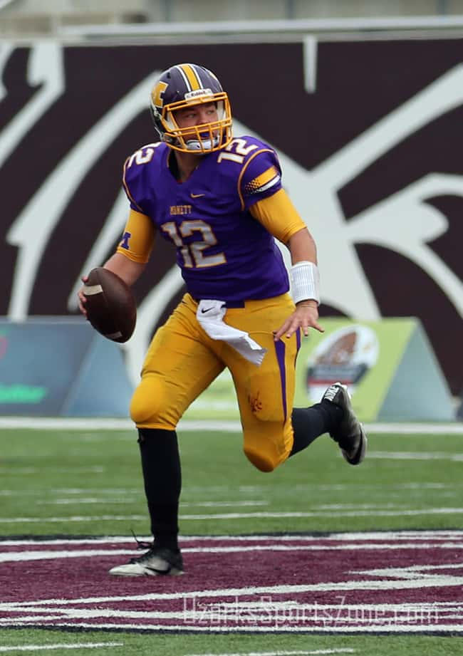

Monett football is a classic football uniform design. The yellow block “M” on the helmet goes well with the thick yellow stripe down the middle flanked by a pair of white stripes. The purple uniform itself wouldn’t be too original but the yellow/white gradient horizontal gradient stripes on the sleeves change that. The two purple stripes on the legs are pretty odd, but that’s what makes them cool and different. Don’t try too hard, that’ll get you in the dance, and that’s what Carthage did here. The blue helmets give off a great sheen under the lights and we like the block “C.” The right-leaning italics of “CARTHAGE” across the chest is a good touch as well. Just a sleek uniform.
(7) Glendale Boys Soccer vs. (10) Joplin Boys Basketball
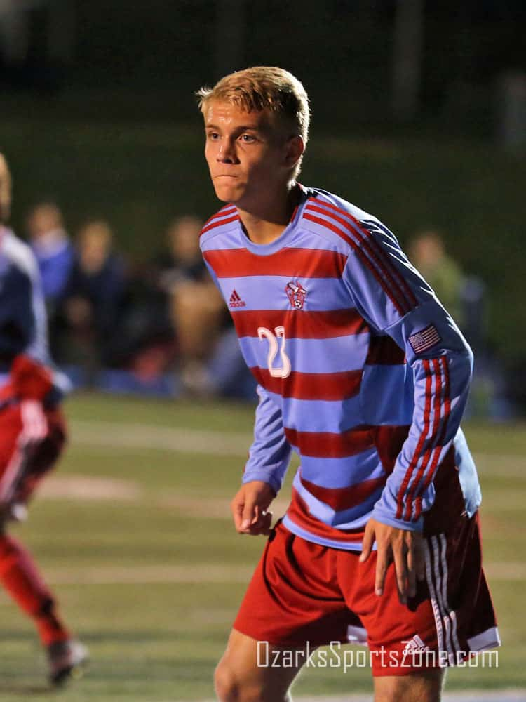

A lot going on here for Glendale boys soccer, but it works. The alternating red/powder blue on the front are a cool feature and are what you want in a soccer uniform. Then, the long sleeves with the three full-length red stripes add something they didn’t need to add, but were smart to do so. Good work. Joplin using the full “Joplin Eagles” across the chest, and in cursive, is a different design that’s pleasing to look at and they’re in this bracket because of it. We also appreciate the simple “J” on the shorts.
(2) Plato Baseball vs. (15) Stockton Football
One of our favorites is Plato baseball. A great traditional uniform good enough for college ball, Plato’s old-school enlarged “P” above the heart shares the front of this uniform only with the uniform number on the bottom-right (an odd but cool spot for a number). Then there’s the hats. Again, the “P” looks great, but what makes these A+ are the colored seams surrounding the cap. There’s nothing like it around, and that’s a shame because it’s so so good. Stockton football brings out some of the best black-on-block unis. We love the tiger logo working itself inside the “S” on the helmet and the understated grey/silver pattern on the shoulders make these modern and great to look at.
CLICK HERE FOR STIRRUPS REGIONAL VOTING